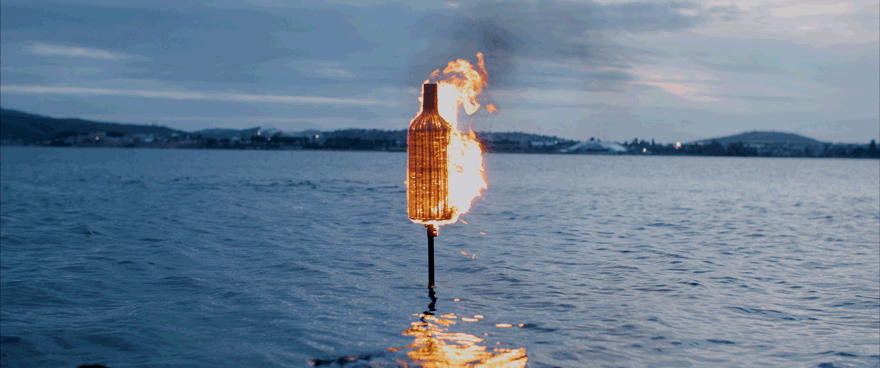
Mona's Festival Of Music & Art
- Won Diemens award for best Art Direction in 2023
Mona Foma. An arts and music festival like no other. Set across Launceston and nipaluna / Hobart over a glowing fortnight in February, artists and musos come from all over the world to create magic in the height of our fleetingly intense Tassie summer. To share in a collective experience at a specific moment on this plane of reality. To lose your SELF. And return to reality a little bit different.
We’ve taken cues from Carl Jung’s Red Book, the pioneering abstract art of Hilma af Klint and 1970s mindfulness propaganda to create a self-deprecating, woo-woo summer identity centred around the photographic portraits of six diverse Tasmanians.
In 2023, the double-circle motif is brought into the physical realm as expressive makeup around the eyes of our six protagonists. While most festivals hero their artist lineup, we’ve put the festival-goer at the heart of our campaign. They’re literally on the posters for it: punters of all ages and diverse backgrounds. This subversion created cut-through in a jam-packed field of festival advertising.
This imagery is complemented by a suite of otherworldly closeups of irises—or are they moving, melting tie-dye patterns? The imagery plays in a vagueness, a beautiful enigma that gives the audience pause. This, coupled with esoteric headlines like ‘Tired of being a human?’ builds a brand that plays with the idea of consciousness and your own journey of festival enlightenment.
- My role: Art Director, Designer
Melbourne Fringe Festival Rebrand
- Won D&AD Pencil award in 2018
Historically, the Melbourne Fringe Festival has re-invented the wheel every year with its communications theme and design language, making it feel ad hoc and disparate. We created a new brand platform and visual identity Melbourne Fringe could refresh year on year.
Everything is Art *for 2.5 weeks talks to the diversity of the Fringe program, while celebrating the festival as an art takeover of Melbourne. The diversity of the festival became the basis for creating a bold design language, allowing for a unifying aesthetic with endless layout possibilities.
We then rolled out a campaign for 2017, working with the Fringe performers to capture the energy, curiosity and fun inherent in Melbourne Fringe.
- My role: Art Director, Stylist, Retoucher
Bonds is an iconic Australian brand that stands for all the things that make Australia great – inclusiveness, fun, ambition and being comfortable in your own skin.
We’ve helped reposition the brand to shake things up a little and re-ignite the consumer’s desire of fashionability. As part of this campaign for the new Originals range, we found a cast of edgy, self-confident individuals who love the skin they’re in.
- My role: Art Director, Designer
Walshie's Wine Cult
- Won Diemens award in 2024 for Best Art Direction
Every season, Walshie’s Wine Cult unleashes a new offering of wines from Mona’s vineyards. The last 12 months have seen us evolve and elevate the branding. We’ve introduced a seasonal colour palette, crafted a mediaeval typeface and distilled our tone of voice to truly express the chaos of a wine cult. We’ve shifted the focus of our worshipful gaze from the world of the cult to the wines of the cult. These subtle distinctions have inspired a boost in wine cult subscriptions and near-cellar-sellouts every season. Praise be.
- My role: Art Director, Stylist, Retoucher
MjMi is an annual program of workshops at J. Walter Thompson Melbourne designed to expand people’s creative and strategic thinking. Staff choose a subject outside their primary job title, with workshops as diverse as Entrepreneurship, Performance, Wine Tasting, Story Telling, VR and Short Short Films.
When creating a campaign to promote the program we wanted to go beyond posters on walls - given the aim of MjMi is to push people beyond their day-to-day routines, we wanted to shut off the agency world and immerse staff in an artistic experience that riffed on each of the workshops on offer.
The sculptures created an unmissable interactive event in the agency to launch MjMi, with supporting posters building intrigue and encouraging people to engage with the program to expand their thinking.
- My role: Art Director, Designer, Construction
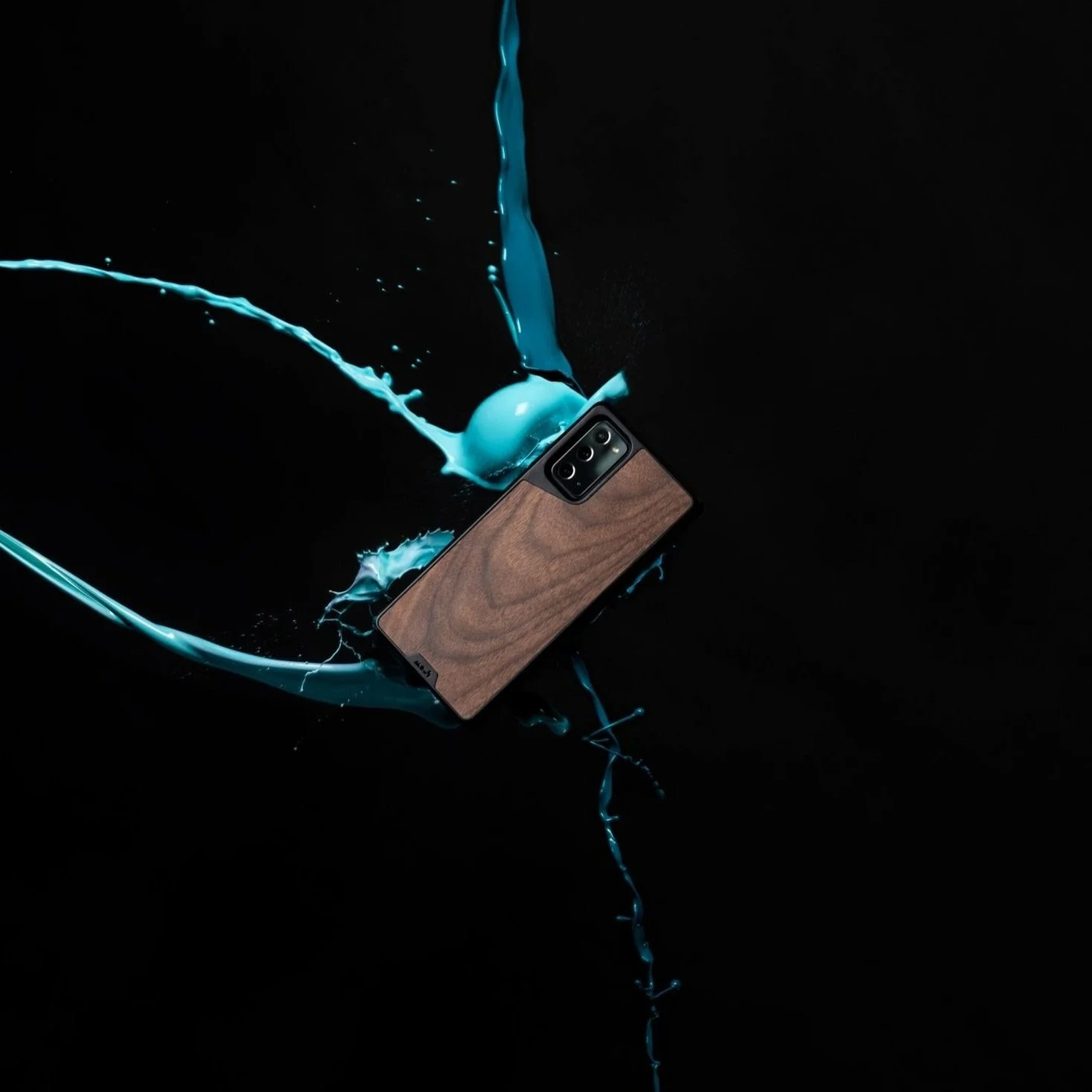
MOUS - iPhone campaign
I worked with a small, creative team at Mous - a London startup, that makes extremely protective tech accessories in the UK.
This campaign ran with the concept ‘Drop Everything’ — a call-to-arms for people across the world to live without limits, and not be stopped by fear of their phone being dropped or smashed.
We knew we had a solid product that could truly survive almost anything, so we decided to show off some extreme product testing around Europe with some equally impressive athletes. We tested each of the three core ranges in locations that embodied their aesthetic and function. We took to Wales with BMX riders, Sweden with a pro figure-skater, and the craggy cliffs of Kalymnos with rock climbers.
These natural testing environments were the backdrop to our entire campaign, which ran across Youtube, TikTok and Instagram, helping us clock over 12 million views on YouTube alone!
- My role: Creative Director, Designer, Stylist, Retoucher
T’Gallant is a winery on the Mornington Peninsula famous for its European varietals. It was founded by a passionate, spirited woman who dared to push the boundaries of winemaking.
We captured her free spirit in a campaign that pulled inspiration and energy from the very place it all began. Calling on people to be the best version of themselves, the most raw and natural, the one that requires no work. Free to be.
- My role: Art Director, Designer
Melbourne Queer Film Festival 2017
While Australia continues to hold out on legislating for marriage equality, the political environment is conservative and hostile.
In this context, the Melbourne Queer Film Festival is an inclusive, determined and positive space in which to share and celebrate queer stories. We wanted to demonstrate this by using our cinema ident to transform hateful political rhetoric from politicians, into MQFF’s positive and powerful symbol.
The demonstrated 3 renders are of the isolation of different tonal values within each hate speech. These visual representations were then combined and animated to create the forms seen in the film.
The outdoor execution highlights the negative commentary that the LGBTQI community face each day. The MQFF logo is formed from newspaper cuttings of national and international press.
- My role: Art Director
Bonds released a colourful unisex range for kids - a first for the 100-year-old company.
This campaign’s direction was all about range and colours for boys and girls regardless of their gender.
Note to self: Photoshoots on city rooftops with 10 year old kids in 40° heat are a challenge.
- My role: Art Director, Designer, Copywriter
MOUS
Whilst working as the Creative Lead at Mous in London, I worked with a small, in-house production team to create all of the seasonal content and launch a vast range of products.
From product-heavy campaigns that focused on the extreme protection the accessories provide — where brand storytelling and aesthetic is incredibly important — to crazy product launches that piggyback from Apple’s seasonal launch dates.
For last year’s iPhone 12 launch, we wanted to go even bigger, and as 2020 had been so up in the air, creating pressure around production and scheduling, we took to the sky in a hot air balloon to test our product from 45 feet in the air… and it survived!
From the start of my time with Mous, I pushed for the brand to become more well-known and memorable in the tech world. Through attention-grabbing content and pairing our extreme protection with extreme sports and stunts, we became one to watch, and a leader in the category across Europe and the US.
- My role: Creative Director, Designer, Retoucher
The Children’s Book That Isn’t Really A Book.
If we wish to spur a generation of imaginative, fuelled creators we need to start while they’re young. In an age where humans bow readily to technology we can create a product that finds time and cause for parents and children to switch on their imaginations and dive head first into unwritten adventure.
I decided to try my hand at creating a new children’s book with a small team of fellow creatives. One that isn’t bound or constricted by pre-determined words or rhythms. This story gets shuffled and your’s and your child’s voices lead the way.
Tales Unbound is a million bespoke, personalised, children’s stories yet to be written.
You can pick any illustration from any themed page, and link them together as you go. From disasters to characters to places and objects, everything you need for a great story is there. The pages give you the main ingredients for an epic tale. The rest is up to you.
P.S. If you get a little stuck, there’s a helpful imagination kick starter on the back of every page.
- My role: Art Director, Designer, Illustrator
F*CK The Art World Condoms
Mona (Museum of Old and New Art) decided that the artworld screws people all the time. So they made some condoms so you can screw back (and stay safe) with a tasteful collection of premium prophylactics.
What better way to screw with the artworld than to poke fun at Jeff Koons and his infamous balloon dog. This was a super simple concept with a slimy construction and satisfyingly stupid end result.
Perfect for highly cultured coitus or a conceptual quickie.
- My role: Art Director, Designer
Moo Brew
- Won Diemens award for best Packaging Design in 2023
Every season, Moo Brew stashes some of its infamous stout into barrels and leaves it to age in the dark. Twelve months later, it’s released into the light—a momentous occasion that Moo fans wait all year for.
When people received their limited edition of barrel-aged stout, they performed the ritual of bringing the dark into the light: unwrapping the sheaf of black paper to reveal the stark, white label, and then pouring the legendary black liquid into a glass. Darkness released.
We did something completely different in a category overflowing with dark, blokey labels. We designed a label that’s entirely white, with a subtly embossed texture that satisfies the hands as much as the eyes. The cut-out window in the label’s centre hints at the liquid darkness within—resulting in a product with subversive shelf appeal. And it drew people far and wide.
- My role: Art Director, Designer
- Won silver Clio Award in 2016
After 26 years in a cultural city with plenty of festivals, the Melbourne Queer Film Festival was experiencing audience fatigue. Worse, it was going head-to-head with the much bigger Melbourne Comedy Festival. With a fraction of the marketing budget, we needed to remind Melbourne audiences just how important MQFF is in the global fight for equality.
We returned to the rebellious roots of the festival with a billboard campaign in Melbourne – completely written in Russian and proudly flying the rainbow flag – advertising that the opening night of the festival would be live streamed to Russia. We then encouraged the world to share the billboard to Russia’s queer community via social media. This became a symbol of defiance against Russia’s ‘gay propaganda’ law. By reaching out to a country whose queer community faces open hostility, we reminded Melbourne audiences how lucky we are to have MQFF and how important it is to celebrate it.
The campaign was shared all the way to Russia, reaching over 2 million people and achieving 3.3 million social impressions. It was reported on from Melbourne to Russia. As a result, MQFF saw its best box office results in five years, including a dramatic spike in the number of first time attendees. Crucially, the festival attracted a much younger and more diverse audience.
- My role: Art Director, Designer
Spirit of Tasmania is a ferry operator sailing between the Australian states of Victoria and Tasmania.
‘The Spirited Traveller’ is a platform we developed to capture the mindset of those who’d rather take their own car, skip the drama of flying and have a memorable on-board experience.
This latest iteration explores the comparison between sailing and flying while promoting the freedom and ease of choosing sea over sky.
- My role: Art Director, Designer, Copywriter
Bonds Christmas Campaign
I worked with Bonds and a broader team to create a Christmas campaign that showcased a white, hot, Australian Christmas.
The campaign ran with the line ‘Get in the Spirit’ which acted as a call to arms for Australians to join in the festivities and spread a little joy.
We decided to flip the whole idea of a ‘white Christmas’ on its head and use the Aussie white sand dunes and the salt mines for our campaign.
With a dazzling range of underwear and a twist on a classic Christmas, we brought to life a bright and festive campaign to see out 2018.
- My role: Art Director, Designer
Melbourne Queer Film Festival is a major cultural event for the city. And for 27 years, it’s been giving a platform to films and ideas that wouldn’t otherwise have a voice.
The aim was to develop a logo that embodies the spirit of MQFF - past, present and future. Something that encompasses the community, the sense of purpose and inclusivity, and optimism. An icon that stands for strength, film and the queer community.
Melbourne is a unique, creative, cultural community and MQFF deserves a striking, modern, highly versatile piece of cultural capital that sums up the festival’s ideals, and cements its position as an important Melbourne and international cultural event.
I developed a unique icon that evolves the current MQFF logo into a powerful symbol that can become a beacon for the festival over time. It is born from the letters ‘MQFF’.The M is largest as it represents the fact that the festival is a wholly Melbourne event.The Q is the beating heart of the festival. It also represents a film projector - so the core purpose of the festival is integral and central to the overall logo design. Both the F’s lock the whole icon together as a representation of solidarity and community.
- My role: Art Director, Designer
The Victorian Youth Symphony Orchestra is Melbourne’s oldest orchestra – nurturing emerging musicians and expanding perceptions about classical music. So we have expanded the perceptions of what an orchestra should look like. Not stuffy or old-fashioned. Rather – edgy and dark. Cool.
Each key visual derives from the content of each of the four concerts VYSO will play this year.
- My role: Designer
nudie are known throughout Australia as the go-to, all natural juice brand. So when they decided to release a new Icelandic yoghurt range, the idea had to keep the friendly and whimsical tone of voice while heroing the high protein message.
We created a range of short, dynamic headlines to stop consumers in their tracks. These were spread across a range of large scale out of home placements and saw the product launch to a welcoming market.
- My role: Art Director, Designer, Copywriter
Museum of Old and New Art Wineries
Mona (Museum of Old and New Art) owns two wineries in Southern Tasmania. Moorilla and Domaine A. Both wineries fall under the Mona brand, but the art direction is born from a place of luxury.
Whether it's a social launch, and eDM, or an update to the website, we try to capture the natural beauty of the space and the process, and tell our story.
- My role: Art Director, Stylist, Retoucher
I concepted the latest look and feel for Bonds Spring/Summer 2018 and Autumn/Winter 2019. The images were to cover store fit-outs, OOH and social channels.
We used a humorous tone of voice to highlight what’s on offer at the Melbourne Queer Film Festival.
To draw in a wider audience we needed to play on the fact that ‘we do movies differently’.
Through cheeky parodies and synopsis bending headlines we brought in a new audience for the festival and saw the highest ticket sales in over five years.
- My role: Art Director, Designer